- Worksheets
- Games
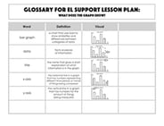
- Lesson Plans
- Workbooks
- Exercises
- Science Projects
- Skills Progression
- More
Search Scaled Bar Graph Educational Resources
30 filtered results
30 filtered results
Scaled Bar Graphs
Sort by


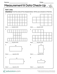
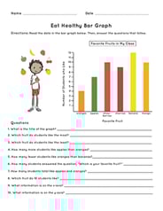
Data 1
Guided Lesson
Data 1
Learning how to represent numerical information is a key part of the third grade math curriculum. This lesson in data provides guided instruction designed by our team of curriculum experts and teachers to present this concept in an engaging way. Not only that, but helpful exercises help kids to see the practical applicaton of these skills in the real world.
3rd grade
Math
Guided Lesson

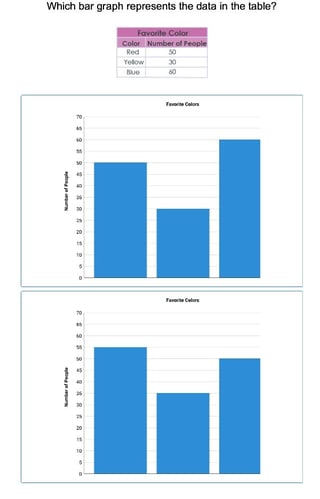
Data 2
Guided Lesson
Data 2
Understanding data and graphs is a critical skill that we use on a regular basis to read news articles, reports and other media to interpret information. In this unit, students investigate data collection, data organization and visual representation in different kinds of graphics (i.e. line plots, pie charts). Learners also apply concepts of probability and statistics to analyze data.
5th grade
Math
Guided Lesson